This post is just a couple of things that I love and things that I feel like could be tweaked or edited when it comes to the new Steve update. These are all personal likes and dislikes I have with it that I just want to get out there. No ill will to the developer or anything. This post may be a little long. This post will also not feature any feature requests since This is a General post lol. I will first start with the things I like about the update because I don’t want to just be negative the whole time lol
Praises
First thing I like about the new update, despite being kinda small, is the new shape for artworks. Steve seems to takes a lot of inspiration from Apple music and that UI, so I think the more boxy artworks do differentiate it to apple music and make it feel more unique compare to it. Although i wouldn’t mind a toggle/ slider since I feel a lot of people may prefer the more rounded apple’y look y’know. But I personally don’t mind the change and quite like it.
Finally we have the ability to have playlists in grids! I have been waiting too long for that lol. Same thing with albums. Just having the ability to do so opens up organization tenfold and it makes the screens feel a lot less cramped. And for people who have waaaaay too many albums and playlists (like me), it gives them a more clean looking page of artworks.
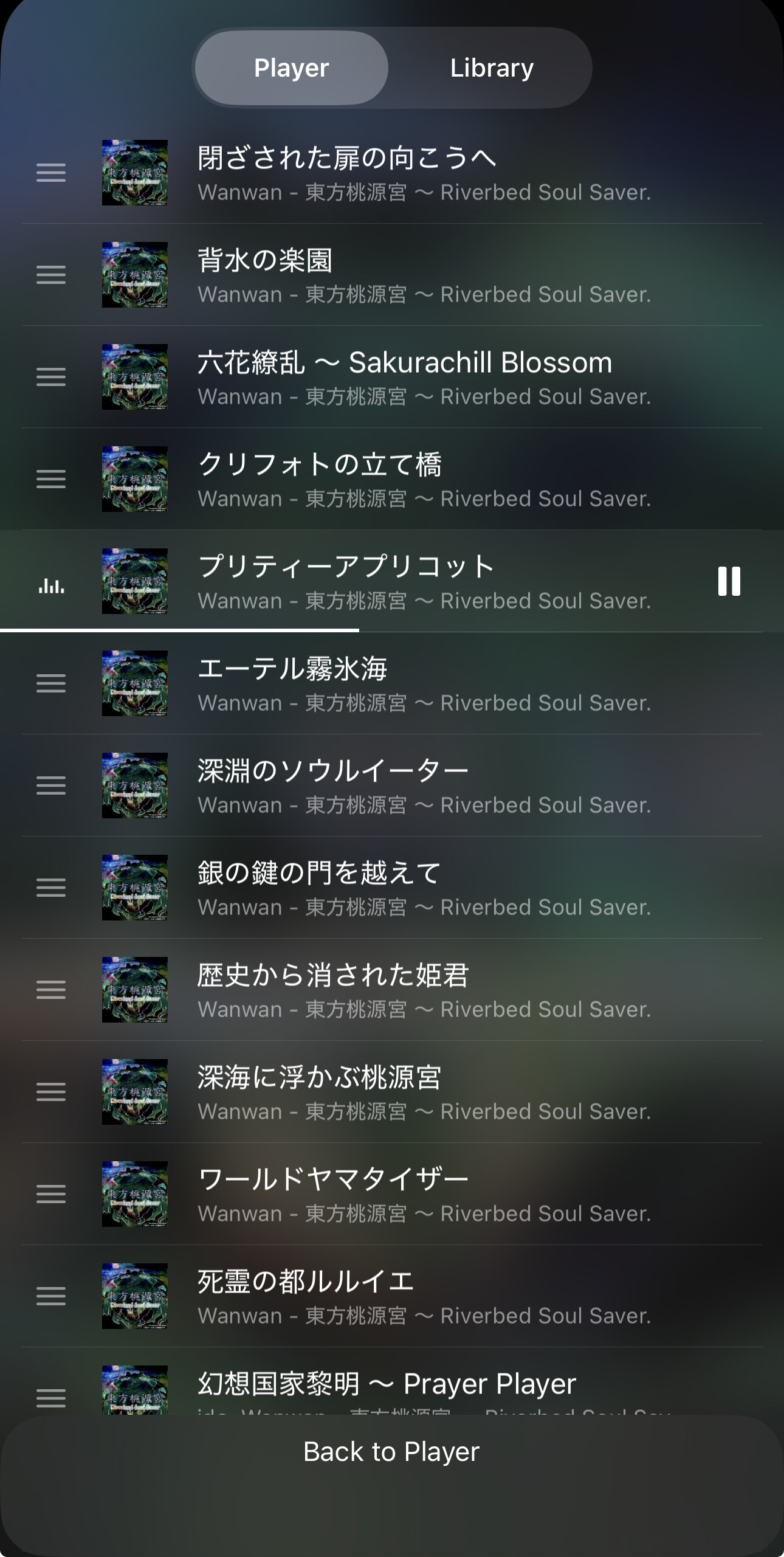
The ability to also manually move them is great since for playlists before, you could only rely on putting the folder or playlist in order one at a time, or rename them and close the app so they moved to the bottom. Same thing applies to albums but the sorting for that was a lot worse at the time since there was barely anything you could do to move them in the right direction like with playlists.
Moving multiple songs is incredibly convenient. Not much to really say there, although i do wish the feature was brought to manually moving playlists and albums for a bit of consistency.
Also pretty small but being able to hide the skip or go back 10 secs buttons is very very nice. I used to use documents as my main music player (Maybe that’s why I was spoiled with organization lol). But they had a feature to either have skip track buttons or skip 10 secs buttons. I never used the 10 secs buttons so the player on there was a bit cleaner in my eyes. I am happy we have the option to disable it or enable it since I know a lot of people probably would use the 10 secs button, or just like it for aesthetic.
Keeping cover colors. It is just so nice honestly. it’s small in the grand scheme but I am grateful they took my request into account. It’s just really nice and great for people who want the option of a more minimalist or consistent with theme player screen.
Also all the bug fixes. ones that I have experienced and ones others may have. Bug fixes are always nice.
Criticisms
Although I do like the update and all the features it brings, there are some changes I personally dislike or thing they could be tweaked to be better. For this I will add some very shitty drawings to get my point across.
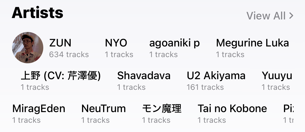
First is the how the artist widget looks when you’re on the page. Before, the names of the artist had small shaded pill shapes behind them to make them pop out and their names more readable. But now the shade behind the names are gone. Not to be rude or anything but it just looks worse now. Also it makes the names a lot more unreadable especially on certain themes, since it now looks like just a bunch of words floating. Honestly when i first saw it, since I have my artists as the top home screen widget, I thought it was a bug! Which it may be. I think it should just go back to how it was.
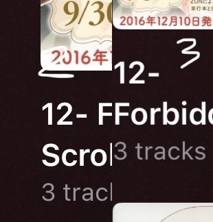
Playlists, when it comes to being set to 3 playlists per row, doesn’t change font size to match. it does so for the numbers 4 and 5 but not 3. This is annoying for me since I use 3 and it just makes the page still look cramped to a degree. This is pretty small but it adds up. I think the fix here is just to set it to the same font size used in albums when that is set to 3 row grids. And also remove the 3 dots in the bottom right corner since that takes up space the text could be using. You can hold down the playlists for the exact same options so I see it as pretty redundant to have.
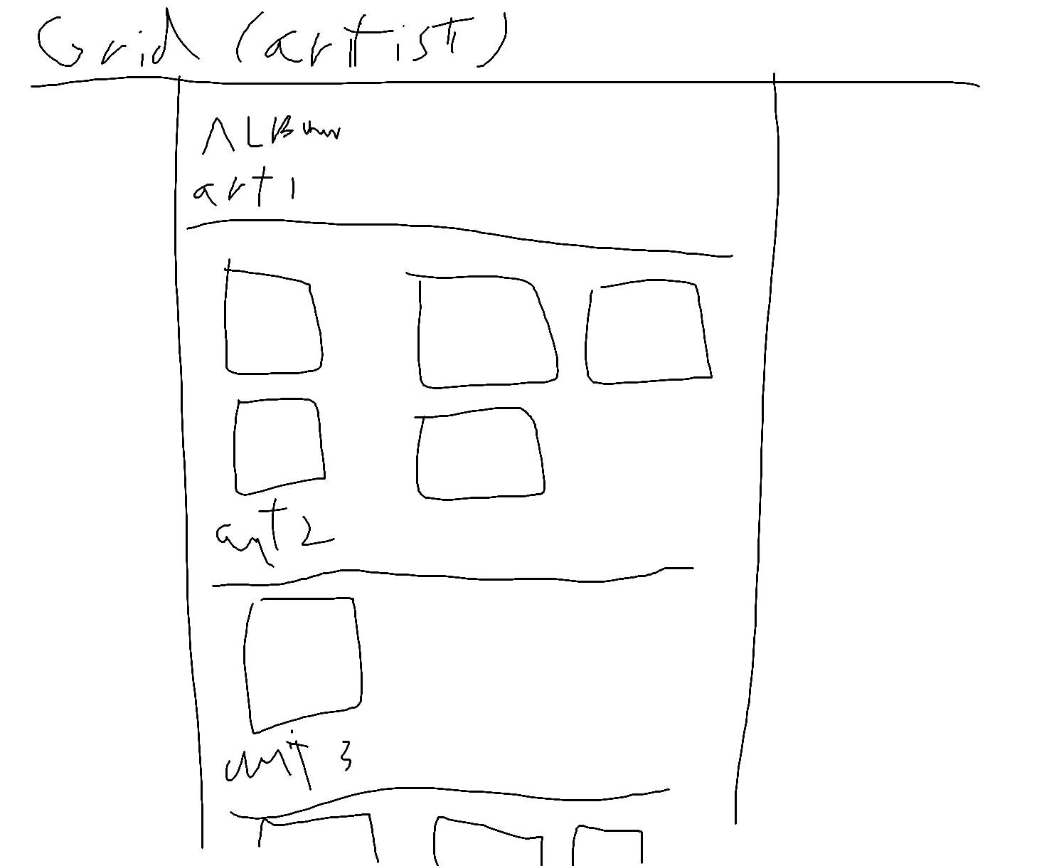
Albums when set to grid don’t have really any order. I like having the ability to set it to grids but one thing the grid option has compared to “by artist” is sectioning off albums by artist. The grid sorting is nice don’t get me wrong, it’s just kinda messy. My fix would be to rename “by artist” to just “list”, and make “by artist” a toggle or something. It would be a toggle that segregates the albums by artist. Here is a drawing of what I mean:
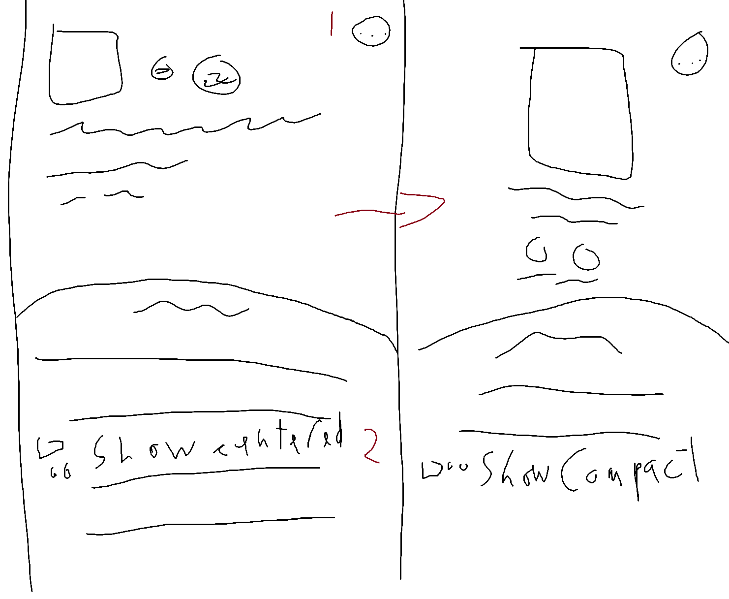
This one more of a personal preference, but I think the new look when you enter an album or playlist is not as good and looks as good as the original. I will go over my grips with it first and then what I think it does right. Album art is now a secondary compared to the name of the album due to it being much smaller and to the side. I liked how before the album art was front, large, and center. This is more text focused than cover focused now. The new placement of the play and shuffle buttons is worse. Where they were before was more convenient and looked nice due to it being centered. Now you have to reach higher and they are a bit to the side. I liked when the art was in the center because to me, it gave an effect of a large starry cylinder surrounding the artwork and the tracks, and now the effect is gone. But I do think the new UI does do one thing nice. It is a lot more compact, which some people would like more than the old one, and more tracks are visible from the get go, so it’s also a bit more track focused the the original. I think the best way of getting the best of both worlds would have an toggle for the new and old UI, since I, and probably a lot more, feel the old UI for Albums and Playlists looked nice and worked better. While others may prefer this more compact UI.
This is also a personal preference but the old small widget for now playing looked better. It’s mainly do to the text being unreadable at time especially with clear icons, and that you can’t show off the theme color if you are have colored icons lol.
Tweaks
This is just a couple of small improvements I feel like would be nice for the experience.
-
Allow users to change or add the country of an artist on their artist page, instead of relying on it being automatically picked up.
-
Add shuffle button option to now playing screen like the equalizer or speed control. it is annoying if you are in a song you have to go back to the playlist/ album page or press up next and find the button. I don’t know if that would be hard to shuffle a playlist/album mid song, but a example of it working is documents.
-
A cleaner “up next” pull up. The current one is a bit of a mess. Like why is the shuffle button in the top corner next to clear all? Why is Add Next and Add to End square when most other buttons are rounded? Why doesn’t it match the color of the artwork even if I have it enabled? I think one as nice looking as the one in documents with the utility and functionality as Steve’s would be great!
-
Edit Size of the UI. This would be a nice accessibility feature. The closest thing to it is changing the size of the font but I think that’s a pro only feature. Having a slider to change the size of most elements would be nice for those who need it.
-
Allow user to change the color of genre blocks.
-
Slightly better manual sorting for playlists and albums. Unlike tracks, you cannot select multiple albums to move, which may be a problem with how they work to be honest. Also allowing the person to just drag and drop them in a spot would be nice and a bit come convenient since we can see where they end up. heck if you hold a playlist down you can wiggle it a little lol.
-
Speaking on albums, just for a bit of consistency I think that just like playlists, if you hold down an album it brings up “rename” or “delete” since if you hold one down nothing happens.
And that’s really all I have to say. I think the update was really good despite my criticisms. I am grateful that some of my feature requests helped to influence this update. Maybe I let smaller things bother me too much since the app works fine! But I hope some of these nitpick can be heard, understood, and possible taken into account for any other future update. Since despite my complaining and nitpicking I really do want this app to be great! Also sorry if there are spelling mistakes or bad grammar. If you need clarification or a more detailed explanation please ask.