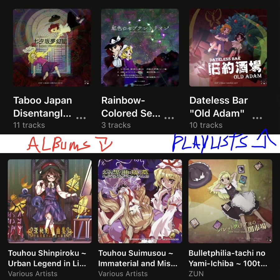
I don’t know if this is an intentional decision or a consistency issue, but the art and spacing for albums are noticeably bigger and closer than the art and spacing for playlists on every grid size. This may have been a thing before but now that you can have both as grids it’s a lot more noticeable.
Image of playlists and albums both at a grid size of 3 (probably more clear with light theme):